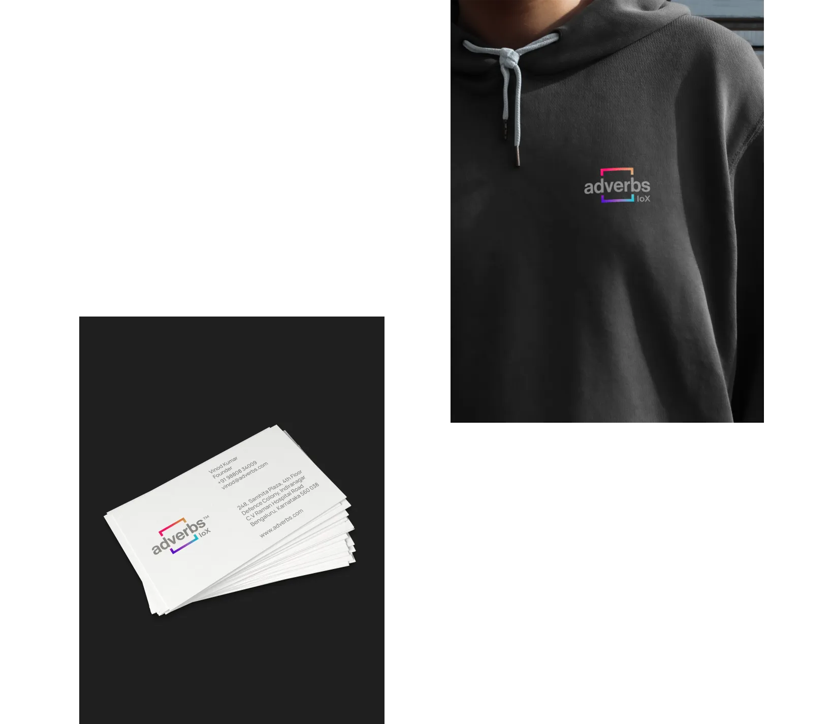
Fluid colours and patterns intersect and play in a logo that is a window to these experiences that one can pick from. The spectrum of colours represents inclusivity, openness and acceptance, creating a safe space for everyone and everything. It is a window, providing an access to the pulse of the time, trends that are changing and the people who change it. Inverted, the gaze shifts to oneself - understanding more about who we are.A truly progressive idea is forever adapting, changing, serving. It adapts as it traverses through time, space and matter. Like water, it is fluid, dynamic, holding energy. Like water, it reflects the environment around it. In its untouched form, it reflects the VIBGYOR, holding the potential of the spectrum.


