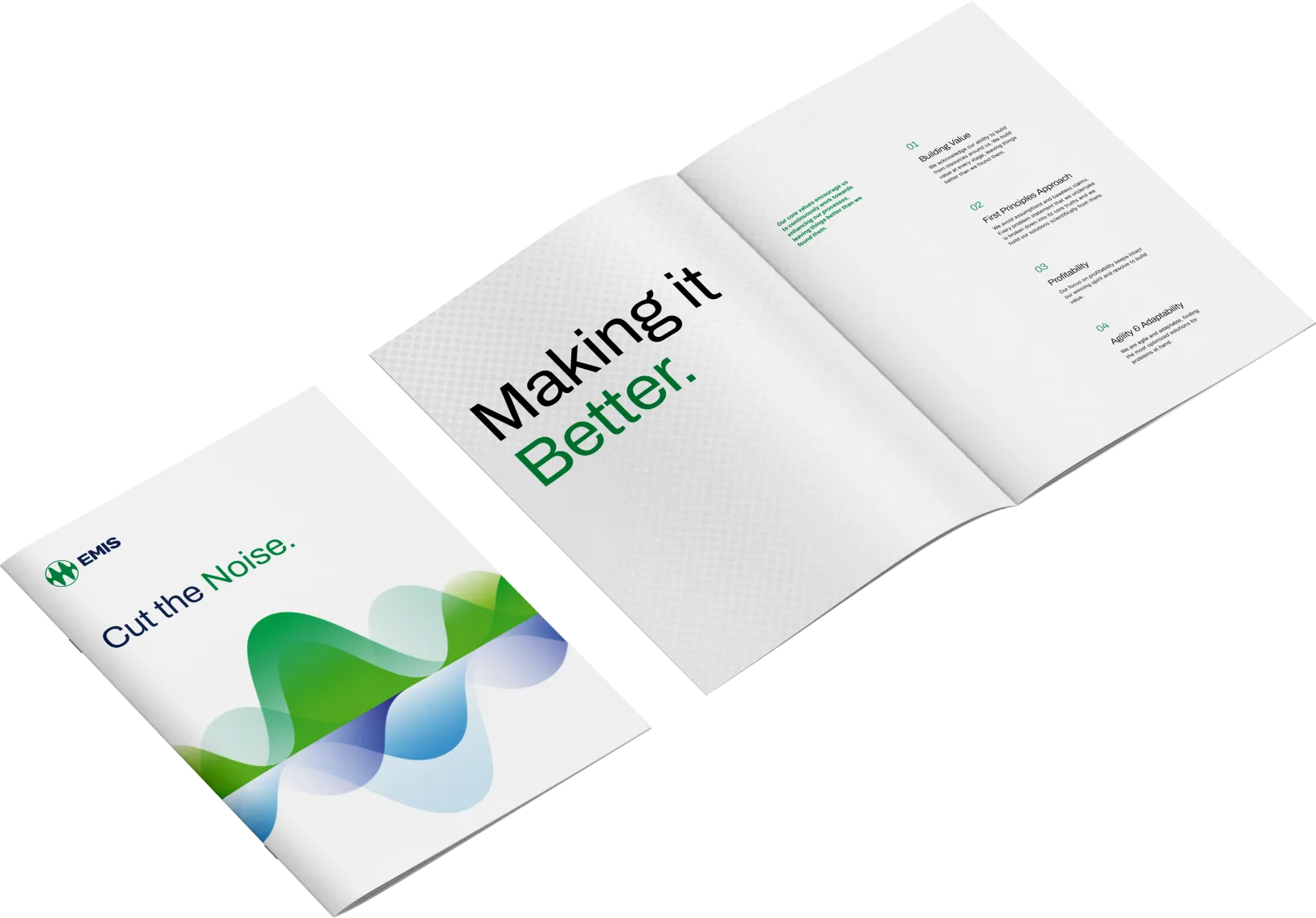
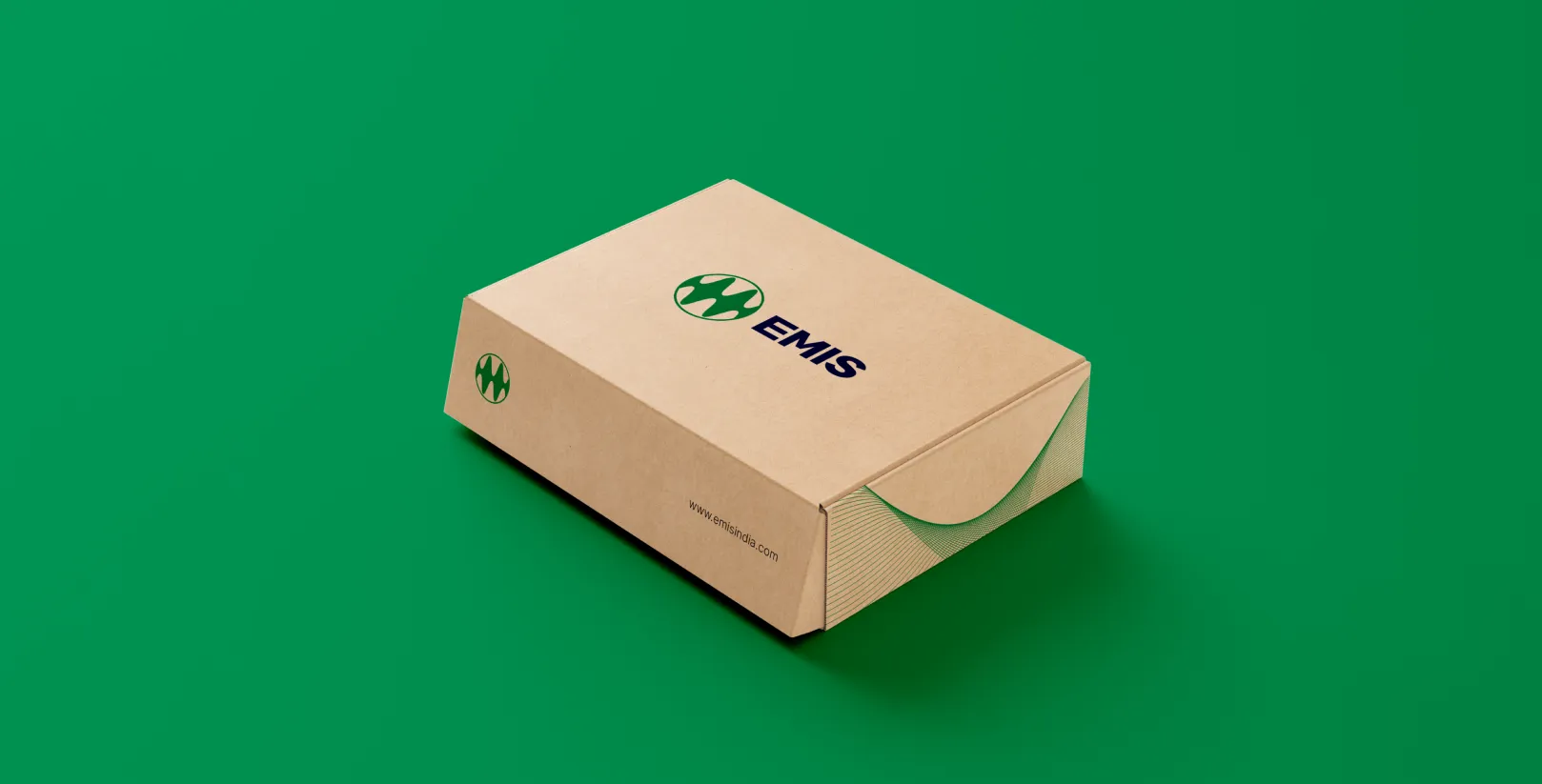
The identity is composed of two parts, a circle and a frequency wave. The circle represents the world and the global footprint of the brand. The frequency wave denotes the continuity, the idea of optimising with each iteration. The emerald green is a new entrant in the industry landscape, portraying freshness and growth. The juxtaposed font is open, sans serif yet structured. It brings symmetry to the movement. The brand design conjures up continuity in a static design element, a clutter breaker in the world of steadfast, heavy logo identities. The modern strokes represent the brand idea of being agile, ’making it better’, and keeping up with the changing pace of the world around it.
