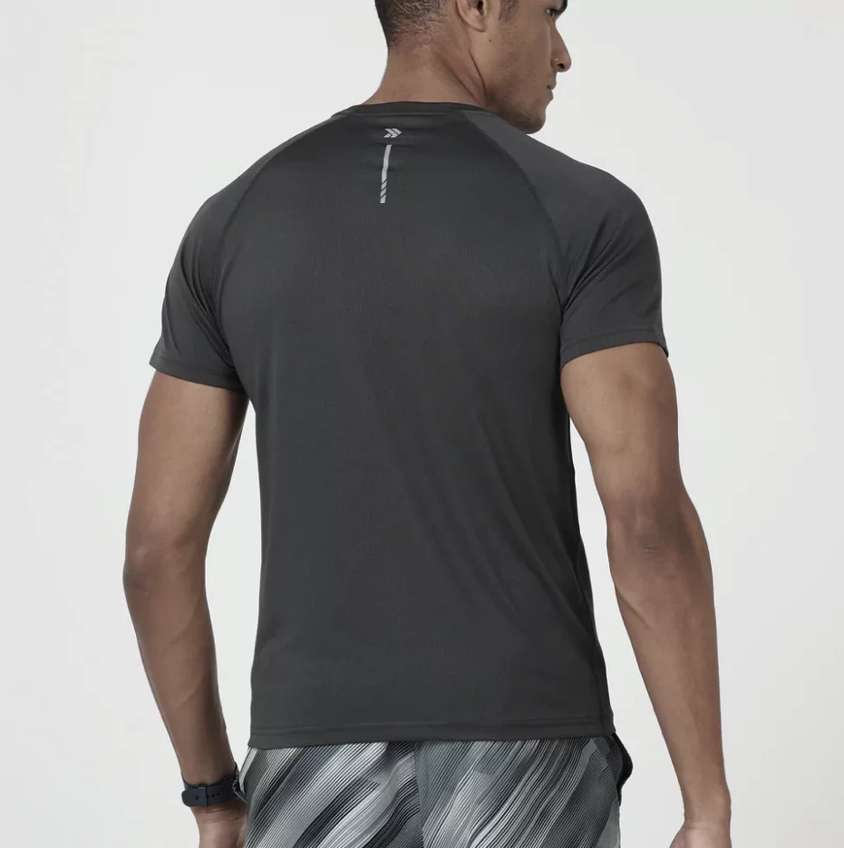
The brand logo is a modern and spartan black on white, allowing space for emotions in the brand world. The angular stroke and an abstract arrow depicts movement and speed. Muted tones were chosen for the secondary colour palette, with a lively but sparingly used accent colour allowing the brand visuals to take up space and be the hero of the communication. It also allowed flexibility in individually focusing on health, fitness and leisure, the three areas of attention for the brand. With a tagline of “Every move matters”, Jolger positioned itself as a gentle, supportive partner.


