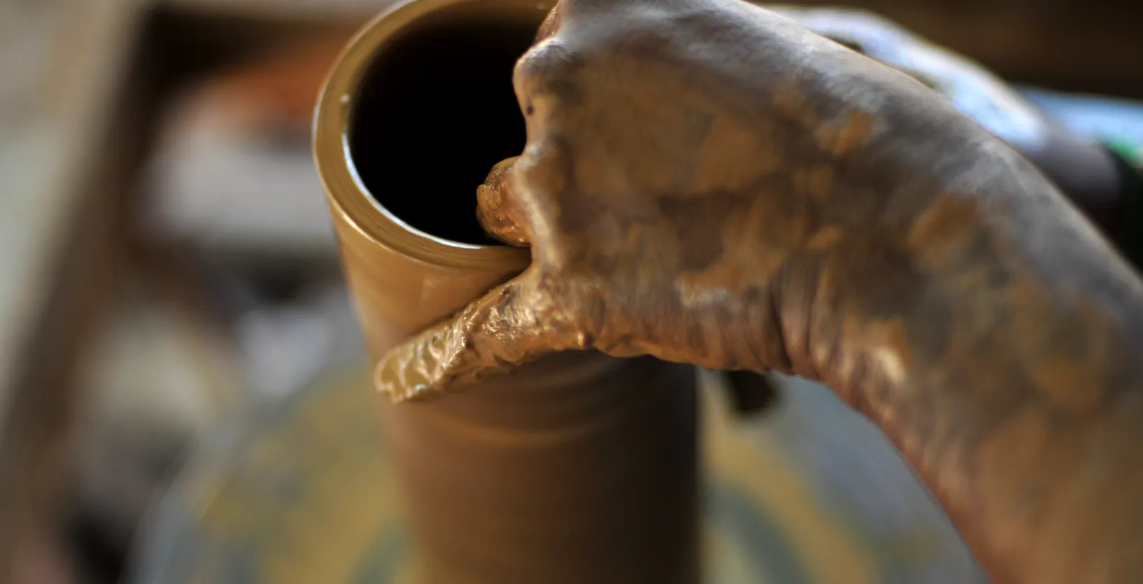
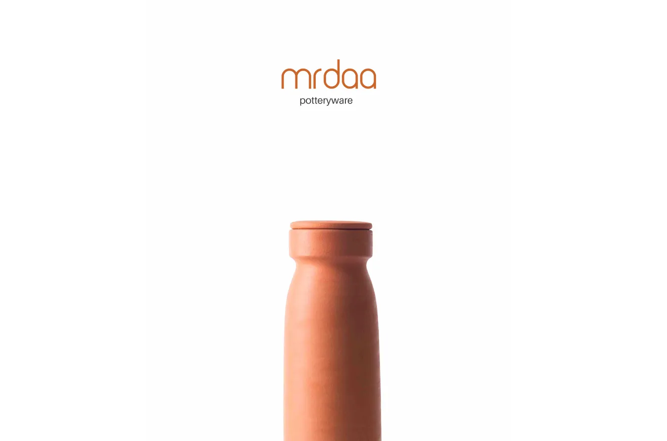
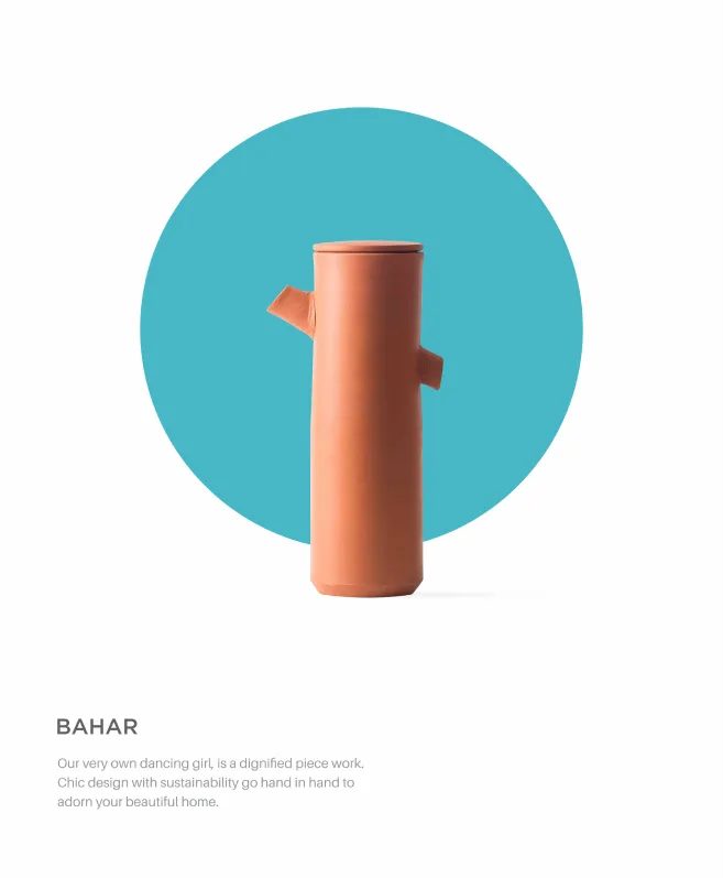
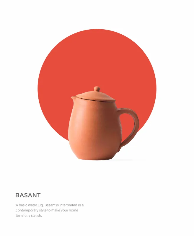
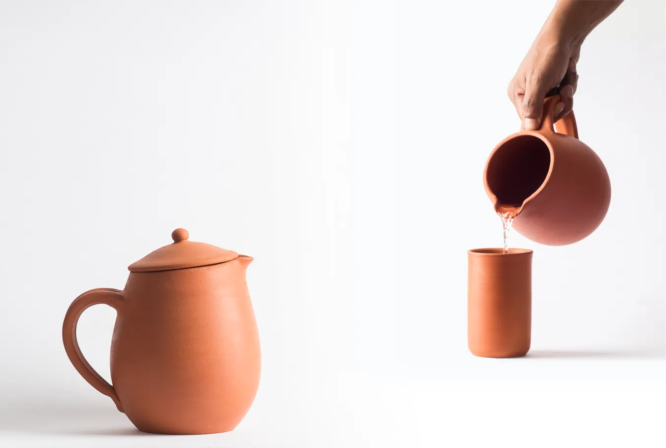
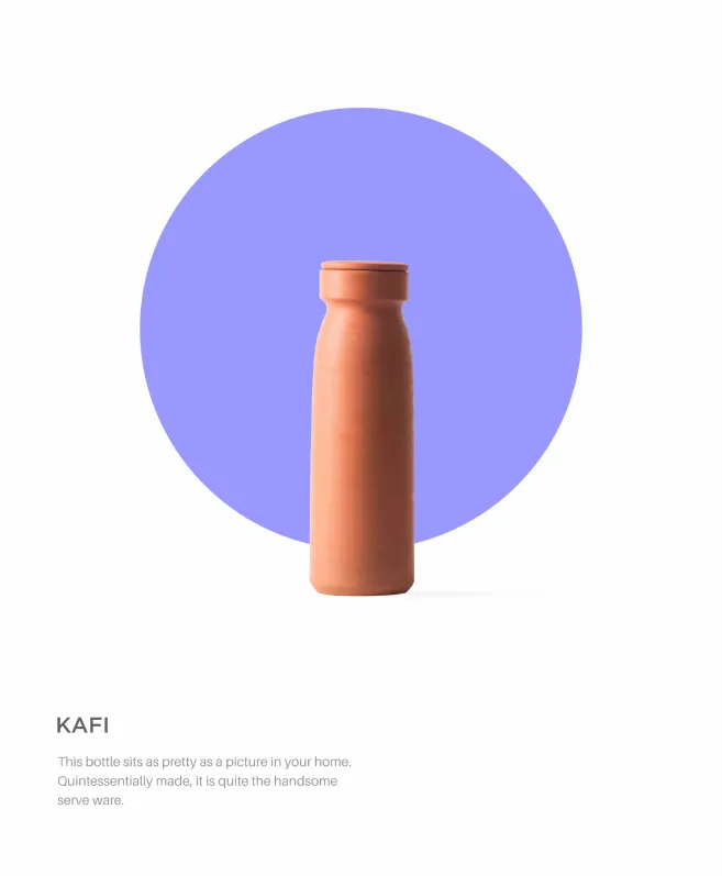
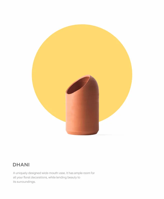
Earthy tones annex the canvas as their own, simple patterns are relinquished to the background to elevate the simplicity of the clay. The brand logo is sculpted - with the typography arching and bowing as the letters spell out the brand. The earthen clay shade was chosen as the primary shade. The product line stood out against the stark contrasting white, lending it a sophisticated look while retaining the romance. The product nomenclature is an extension of the sonnet that is woven around the brand. Rustic, simple words that are parked in our memories. Words that are more a feeling than a description. For example, Dhani literally means green; but it takes one back to the fields dancing in the winds.

