Brand Design
Client:
Wenge Wood
Timeless elegance, etched in wood.
Challenge
Wenge Wood is a furniture design and manufacturing house that boasts of clients of large hospitalities and some of the world's most exclusive private residences. As a facilitator of luxury experiences, it needed a brand identity that spoke for its portfolio and clientele.
The truest things are often the simplest. No stranger to the world of design pedigree and style, the brand that is subtle and chic, fitting seamlessly amongst its patrons.


Approach
Minimalist, derivative form in a rustic gold convey makes an understated and timeless statement.
Deliverables
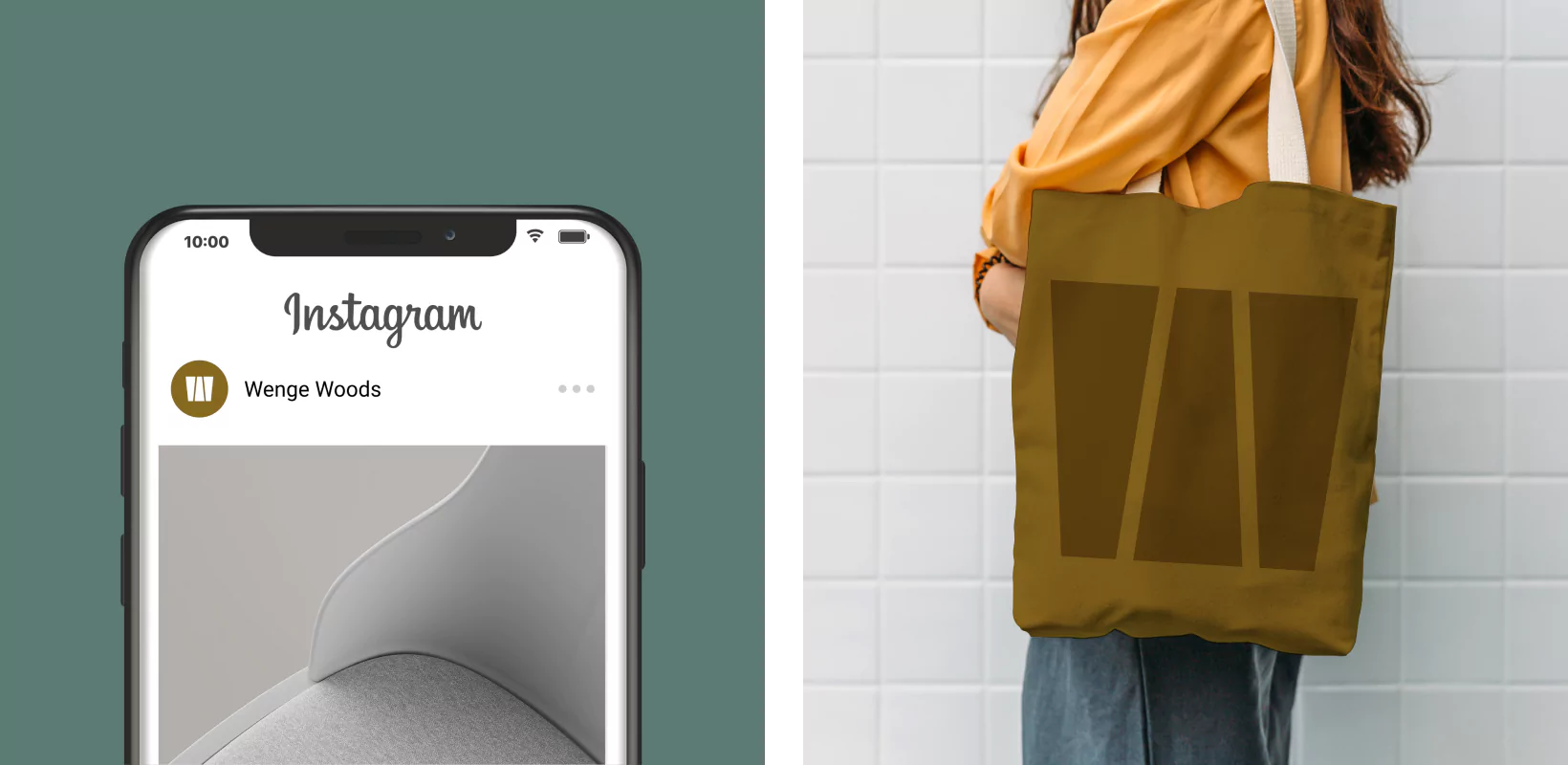
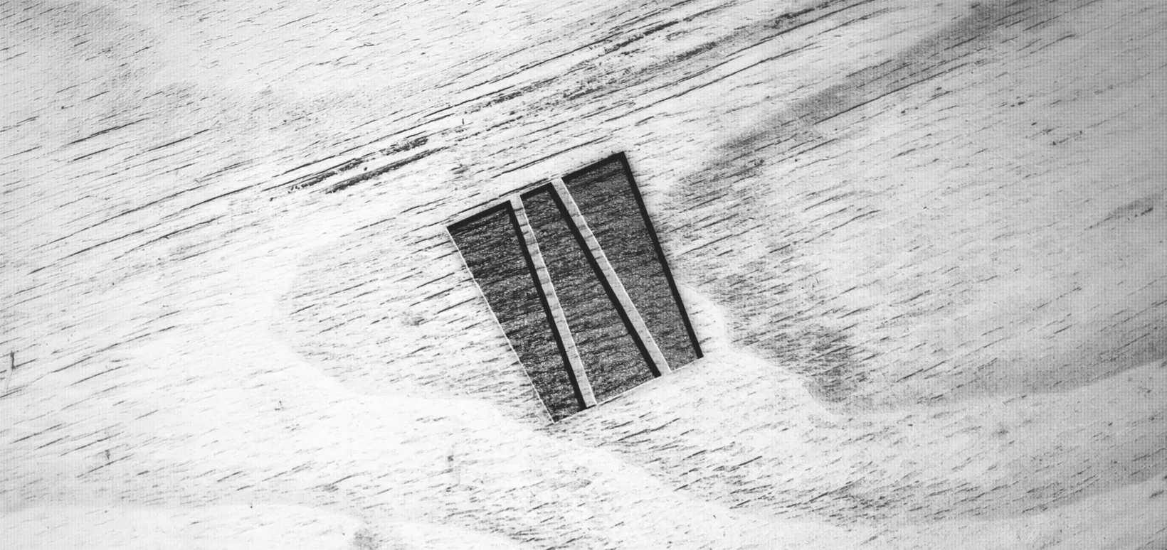
To keep up with the pulse of the design world, Wenge Wood was given an animated logo. Known for its tensile strength and elegance, dovetail interlock was chosen as the inspiration for the brand logo. The brand’s initials were animated on a regal gold-wooden finish. The simplistic, derivative art form resonates well with its global clientele. The font is open, lending the brand a sophisticated ascetic look. The simplistic logo motif could be recreated as an engrave on the wood, evoking the old world, retro charm of a brand that has been around for ages, and is here to stay. In its digital avatar, the brand pattern is a delicate, ombre rustic gold wood grain pattern over a deep jade background.


